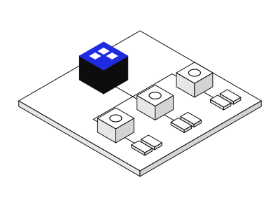
Unifying business software into one platform
A profile-based architecture on a shared data foundation, held together by a governed design system.
- surfaces (not involved)
- design system (involved)
- model (involved)
The "Strates" system
The system behind this site, from token to page template. Three colours carry the page: white to read, blue to assert, black to identify. Two typefaces: Archivo for headings, Schibsted Grotesk for everything else.
It is organised in five levels, each built from the previous one. Components are generic: a card, a button, a tag, with their variants. How the site uses them is described at the level of organisms and templates.
Every token and every component on this page also exists in Markdown and in JSON. Tokens follow the W3C Design Tokens Community Group format; each component carries its level, its file, its properties, its usage rules and a code example.
Values and properties are read from the code at publication time. The documentation therefore cannot describe a component that no longer exists, nor omit a property.
Related writing
The base decisions, named by role and never by value. No component uses a colour, size or spacing that is not a token.
A single mode, with no dark mode: the black sections play that role in the page. Contrast ratios are computed according to WCAG 2.1.
| Token | Value | Usage |
|---|---|---|
--color-background-canvas | #ffffff | Page background. |
--color-background-brand | #1f2be0 | Hero column, Position block, On tags, hover fill. |
--color-background-inverse | #0d0d0d | Identity bar, dark board, footer. |
--color-background-subtle | #f5f5f5 | Inset, figure frame, floating box, card hover. |
--color-background-overlay | rgb(13 13 13 / 0.4) | Veil behind an open dialog. |
--color-surface-inactive | #e7e7e7 | Off tag. |
--color-surface-placeholder | #d4d4d4 | Placeholder for a visual not yet delivered (preview only). |
--color-text-primary | #0d0d0d | Headings and body text. 19.4:1 on canvas. |
--color-text-secondary | #2a2a2a | Secondary text. 14.4:1 on canvas. |
--color-text-muted | #737373 | Metadata, captions, labels. 4.7:1 on canvas. |
--color-text-supporting | #5c5c59 | Text of an Off tag. 5.4:1 on surface/inactive. |
--color-text-inverse | #ffffff | Text on blue or black. 8.5:1 on brand, 19.4:1 on inverse. |
--color-text-on-brand-secondary | #daddff | Secondary text on blue. 6.4:1 on brand. |
--color-text-on-brand-muted | rgb(255 255 255 / 0.8) | Text of an On tag. 5.9:1 on brand. |
--color-text-on-dark-muted | #9a9a9a | Secondary text on black. 6.9:1 on inverse. |
--color-border-default | #e7e7e7 | Subtle separators between rows and cards. Decorative. |
--color-border-ink | #0d0d0d | Rule under headings, outline of the rule button, floating box. |
--color-border-white | #ffffff | Button outline on dark backgrounds. |
--color-border-on-dark | #333333 | Separators on black. |
Nine styles, same names as in Figma. Sizes are fluid between 375 and 1,440 px wide; Body, UI, Caption and Label never go below their size.
Making complex systems legible
.text-display · clamp(2.5rem, 1.972rem + 2.254vw, 4rem) / 0.9375 · Page title, hero line, Position statement, email address.
Making complex systems legible
.text-heading-40 · clamp(1.75rem, 1.486rem + 1.127vw, 2.5rem) / 1 · Section and L card headings, pillar titles.
Making complex systems legible
.text-heading-24 · clamp(1.25rem, 1.162rem + 0.376vw, 1.5rem) / 1 · M card headings, subheadings, L tag.
Making complex systems legible
.text-lead · clamp(1.1875rem, 1.121rem + 0.282vw, 1.375rem) / 1.3636 · Standfirst, insets, blue column sentence.
Making complex systems legible
.text-body · 1.0625rem / 1.5294 · Body text.
Making complex systems legible
.text-body-strong · 1.0625rem / 1.5294 · Emphasised sentence start.
Making complex systems legible
.text-ui · 0.9375rem / 1.3333 · Navigation, follow-up links, contents.
Making complex systems legible
.text-caption · 0.8125rem / 1.5385 · Metadata, captions, S tags.
Making complex systems legible
.text-label · 0.75rem / 1.1667 · Eyebrows and section labels, in capitals.
Four weights only. Bold at 700 does not exist in the system.
Archivo
Schibsted Grotesk
--font-weight-regular · 400 · Body, Lead, Caption, Label.
Archivo
Schibsted Grotesk
--font-weight-medium · 500 · UI, Body Strong, emphasis (`strong`), floating box titles.
Archivo
Schibsted Grotesk
--font-weight-extrabold · 800 · Heading/40 and Heading/24.
Archivo
Schibsted Grotesk
--font-weight-black · 900 · Display.
A single scale, named in pixels, on a 4 px base. The 2 and 6 px steps are for fine adjustments, such as the tag band.
--space-20.125rem--space-40.25rem--space-60.375rem--space-80.5rem--space-120.75rem--space-161rem--space-201.25rem--space-241.5rem--space-322rem--space-402.5rem--space-483rem--space-563.5rem--space-644rem--space-724.5rem--space-805rem--space-966rem--space-1127rem--space-1288remThe measures that structure the pages.
| Token | Value | Usage |
|---|---|---|
--layout-max | 90rem | Maximum content width (1,440 px). |
--layout-gutter | clamp(1.25rem, 0.458rem + 3.38vw, 3.5rem) | Single side margin, from 20 to 56 px. |
--layout-nav-height | 5.375rem | Navigation height (86 px). |
--layout-offset | 19rem | Indent of cards in lists (304 px). |
--layout-strates-width | 16.25rem | Column of vertical tag groups (260 px). |
--layout-section | 8.75rem | Top of home sections and hero, 404 page (140 px). |
--layout-ecrit-tete | 16.5rem | Top of writing pages (264 px). |
--layout-page-tete | clamp(5rem, 0.6rem + 18.78vw, 17.5rem) | Top of inner pages, from 80 to 280 px. |
Motion only exists when it reveals a structure. With prefers-reduced-motion, durations drop to zero and everything is shown in its final state.
| Token | Value | Usage |
|---|---|---|
--motion-duration | 200ms | Hovers, button and navigation fills (200 ms). |
--motion-duration-long | 400ms | Card sweep, reveals, method figures (400 ms). |
--motion-ease | cubic-bezier(0.2, 0, 0, 1) | Curve shared by all motion. |
The smallest interface elements, with no domain content. They only use tokens.
Bouton · src/components/atomes/Bouton.astro · Figma 2:493, 8:480
Triggers an action or leads to a page. Rendered as a link when it has an address, as a button otherwise.
| Property | Type | Default | Description |
|---|---|---|---|
variante | 'plein' | 'contour' | 'accent' | 'filet' | 'plein' | Appearance of the button. |
taille | 'M' | 'S' | 'M' | M by default, S in floating boxes. |
href | string | Address; without it, the button is a button element. |
main : Label.<Bouton variante="plein" href="/travaux">Voir les travaux ↓</Bouton>
<Bouton variante="accent" taille="S" type="submit" value="copier">Copier</Bouton>Encart · src/components/atomes/Encart.astro
Sets an introductory text apart on a light grey background.
Every surface shows the same object, held by the design system’s rules, defined once in the model. Only the use changes, depending on who handles it, human or agent.
main : Text of the inset.<Encart><p class="text-lead">Chapô du cas.</p></Encart>Etiquette · src/components/atomes/Etiquette.astro · Figma 2:494
A text band that qualifies a content, such as a layer touched or a practice.
| Property | Type | Default | Description |
|---|---|---|---|
taille | 'S' | 'L' | 'S' | S (band) or L (heading). |
etat | boolean | true | On (true) or Off (false). |
etatTexte | string | Text read after the label, for example "touched". | |
balise | 'span' | 'h2' | 'h3' | 'h4' | 'span' | Rendered element; a heading level when the tag names a block. |
main : Label.<Etiquette etat={false} etatTexte="non touchée">modèle</Etiquette>
<Etiquette taille="L" balise="h3">surfaces</Etiquette>Lien · src/components/atomes/Lien.astro
A link outside running text, not underlined at rest, underlined on hover.
| Property | Type | Default | Description |
|---|---|---|---|
href | string | required | Address. |
texte | string | Text style class, for example "text-ui". |
main : Label.<Lien texte="text-ui" href="/ecrits">← Tous les écrits</Lien>Atoms assembled into an element with a function: a card, a header, a tooltip.
Carte · src/components/molecules/Carte.astro · Figma 2:489, 9:1600, 2:491
Presents a content in summary, with or without a visual, and leads to it.
A profile-based architecture on a shared data foundation, held together by a governed design system.
A profile-based architecture on a shared data foundation, held together by a governed design system.
A well-designed system reduces the effort needed to go from a need to an action, without removing the landmarks that matter.
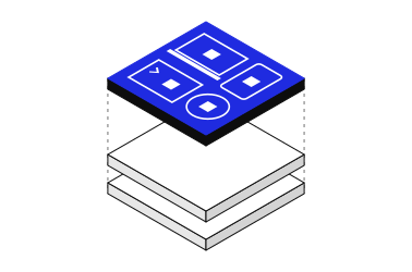
The places where people meet the product. I don’t design a screen, but the presence of the same object on each of them.
| Property | Type | Default | Description |
|---|---|---|---|
taille | 'L' | 'M' | 'M' | L or M. |
apparence | 'ligne' | 'cadre' | 'ligne' | ligne (clickable list row) or cadre (framed block). |
titre | string | required | Card title. |
texte | string | required | Description or thesis. |
meta | string | Metadata line in Caption, for example "company · domain". | |
href | string | Address of the content (row appearance). | |
visuel | { src?: ImageMetadata | string; alt: string; largeur?: number; hauteur?: number } | Image and its alternative text; without an image, a fill holds the space in preview. | |
etiquettes | ItemEtiquette[] | Tags of the Tag group. | |
etiquettesLibelle | string | Name of the tag list for assistive technologies. | |
retrait | boolean | 304 px indent on desktop. | |
titreEtiquette | boolean | false | Title rendered as an L tag (frame appearance). |
niveau | 2 | 3 | 4 | 3 | Heading level. |
lang | string | Language of the content, if it differs from the page. |
<Carte taille="L" titre="…" texte="…" meta="Entreprise · domaine" href="/travaux/…"
  visuel={{ src: image, alt: '…' }} etiquettes={etiquettesStrates(strates, ui)} etiquettesLibelle="Strates touchées" />
<Carte {...carteDEcrit(ecrit, locale, ui)} retrait={false} />EnTete · src/components/molecules/EnTete.astro · Figma 2:488
Opens a page or a section with a Display heading.
| Property | Type | Default | Description |
|---|---|---|---|
titre | string | required | Heading text. |
niveau | 1 | 2 | 2 | 1 at the top of a page, 2 in a section. |
id | string | Heading identifier, for aria-labelledby and anchors. | |
espace | 'section' | 'page' | 'section' | section or page. |
filet | boolean | true | Ink rule under the heading. |
<EnTete titre="Travaux" niveau={1} espace="page" />Figure · src/components/molecules/Figure.astro · Figma 119:8515
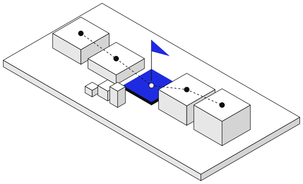
An illustration on a grey background and its caption, in a frame with fixed proportions.
| Property | Type | Default | Description |
|---|---|---|---|
src | string | required | Image address, in public/. |
legende | string | required | Caption in Caption. |
alt | string | '' | Alternative text; empty when the caption is enough. |
ratio | string | '676 / 578' | Frame proportions. |
<Figure src="/images/methode/cadrer.svg" legende="Fig. 04 · Un parcours, ses moments et ses frictions" />GroupeEtiquettes · src/components/molecules/GroupeEtiquettes.astro
A list of S tags, each On or Off.
| Property | Type | Default | Description |
|---|---|---|---|
etiquettes | ItemEtiquette[] | required | Label, state and state text of each tag. |
libelle | string | Name of the list for assistive technologies. | |
orientation | 'verticale' | 'horizontale' | 'verticale' | verticale or horizontale. |
replier | 'mobile' | 'tablette' | Breakpoint below which the group goes into a row. |
<GroupeEtiquettes etiquettes={[{ libelle: 'surfaces', etat: true, etatTexte: 'touchée' }]}
libelle="Strates touchées" orientation="horizontale" replier="mobile" />Infobulle · src/components/molecules/Infobulle.astro · Figma 111:5507
Shows a text before an action, on hover and keyboard focus of its host.
| Property | Type | Default | Description |
|---|---|---|---|
id | string | required | Identifier, for aria-describedby. |
titre | string | required | Box title. |
alignement | 'debut' | 'fin' | 'debut' | Edge of the host it aligns to (desktop). |
main : Text shown.<div data-infobulle-hote style="position: relative">
<Bouton aria-describedby="apercu">Copier</Bouton>
<Infobulle id="apercu" titre="Ce texte sera copié">…</Infobulle>
</div>Modale · src/components/molecules/Modale.astro · Figma 111:5507
A dialog box that asks for confirmation.
| Property | Type | Default | Description |
|---|---|---|---|
id | string | required | Identifier; the title receives `<id>-titre`. |
titre | string | required | Box title. |
main : Text shown.actions : Buttons, whose value becomes the return value of the dialog.<Modale id="confirmation" titre="Ce texte sera copié">
…
<Fragment slot="actions">
<Bouton variante="accent" taille="S" type="submit" value="copier">Copier</Bouton>
<Bouton variante="filet" taille="S" type="submit" value="annuler">Annuler</Bouton>
</Fragment>
</Modale>Molecules and atoms assembled for a task of the site: copying a link, presenting a method pillar, navigating.
CopieLienIA · src/components/organismes/CopieLienIA.astro
Copies a prompt ready to paste into an AI assistant, with the address of the site's agent version.
| Property | Type | Default | Description |
|---|---|---|---|
libelle | string | required | Button label. |
confirmation | string | required | Message after copying. |
echec | string | required | Message if the copy fails. |
apercu | string | required | Title of the tooltip and the dialog. |
prompt | string | required | Copied text; {lien} becomes the address of the agent version. |
confirmer | string | required | Primary action of the dialog. |
annuler | string | required | Secondary action of the dialog. |
variante | 'plein' | 'contour' | 'plein' | Button variant. |
alignement | 'debut' | 'fin' | 'debut' | Tooltip alignment. |
emplacement | string | required | Placement, sent to audience measurement. |
<CopieLienIA {...textes} variante="contour" alignement="fin" emplacement="hero" />EmailCopiable · src/components/organismes/EmailCopiable.astro
The email address, large, copied in one click.
| Property | Type | Default | Description |
|---|---|---|---|
locale | Locale | required | Language of the texts. |
<EmailCopiable locale={locale} />PiedDePage · src/components/organismes/PiedDePage.astro · Figma 2:492
The large email address, the signature, useful links and the location.
Shown in place, at the top and bottom of this page.
| Property | Type | Default | Description |
|---|---|---|---|
locale | Locale | required | Language of the texts. |
avecEmail | boolean | true | Shows the large address. |
<PiedDePage locale={locale} avecEmail={false} />PilierDeMethode · src/components/organismes/PilierDeMethode.astro · Figma 2:490
A stage of the method, its sentence and its practices.
I start from usage observed in the field, then set out with Product and Engineering the trade-offs that will fix the product’s rules.
| Property | Type | Default | Description |
|---|---|---|---|
titre | string | required | Pillar name. |
description | string | required | Pillar sentence. |
pratiques | string[] | required | Practices, as tags. |
niveau | 2 | 3 | 4 | 3 | Heading level. |
<PilierDeMethode titre="Cadrer" description="…" pratiques={['Entretiens', 'Tests d’utilisabilité']} />Planche · src/components/organismes/Planche.astro · Figma 27:412
A closing message, a heading over several lines and paragraphs.
Content passed as a slot (on the Contact page: the copyable address)
| Property | Type | Default | Description |
|---|---|---|---|
libelle | string | Eyebrow in Label. | |
titre | string[] | required | Heading, one line per entry. |
texte | string[] | required | Paragraphs in Lead. |
sombre | boolean | false | Dark variant. |
nom | string | Region name. | |
niveau | 2 | 3 | 4 | 2 | Heading level. |
main : Content under the text (dark variant).<Planche libelle={ui.planche.libelle} titre={ui.planche.titre} texte={ui.planche.texte} />
<Planche titre={…} texte={…} sombre><EmailCopiable locale={locale} /></Planche>Page structures. Each template serves both languages; pages only pass it the language.
| Page | Description | Built from |
|---|---|---|
Accueilsrc/gabarits/Accueil.astro | Hero, layers, work, position, method and writing. | Button, Inset, Card, Header, Figure, Copy the AI link, Method pillar |
Cassrc/gabarits/Cas.astro | A case study, from summary to decisions and their rules. | Inset, Link, Header, Tag group, Board |
Contactsrc/gabarits/Contact.astro | The message and the copyable address, on a dark board. | Header, Copyable email, Board |
Ecritsrc/gabarits/Ecrit.astro | A piece of writing, its thesis, cited cases and related writing. | Inset, Link, Card, Header, Board |
ListeEcritssrc/gabarits/ListeEcrits.astro | List of writing, as M cards. | Card, Header, Board |
ListeTravauxsrc/gabarits/ListeTravaux.astro | List of case studies, as L cards with a visual. | Card, Header, Board |
Parcourssrc/gabarits/Parcours.astro | Experience and education. | Button, Header, Tag group, Board |
Systemesrc/gabarits/Systeme.astro | This page. | Button, Inset, Tag, Link, Card, Header, Figure, Tag group, Tooltip, Dialog, Copy the AI link, Copyable email, Method pillar, Board |